Suppose you made a drawing on an orange peel. To take a photo of the entire drawing, you’d have to take the peel off the orange and lay it flat.
But the photo wouldn’t be exactly like the original drawing. Why? Because when you flattened the peel, it would pull apart. The drawing would be separated into sections. This is the same problem cartographers, or mapmakers, face when they create maps. What’s the best way to represent our three-dimensional planet in a two-dimensional drawing? Over the years, cartographers have used different map projections to solve the problem. A map projection is a way to show Earth on a flat surface. All map projections distort, or change, the look of Earth’s geography in some way.
Map Projections
Each outline represents a different map projection of the United States. All the maps center on Kansas. But distortions cause them to show the rest of the country differently.
▲ Cylindrical Projection
A cylindrical projection map is shaped by a cylinder, or tube. Wrap the tube around the globe, and details of Earth are transferred to it.
▲ Mercator Projection
The Mercator map was first developed in the seventeenth century for navigating the oceans. It’s a cylindrical projection map. Lines of latitude and longitude meet at right angles, so compass directions are accurate. But land area is not. Areas near the equator are shown accurately. However, areas near the poles are highly distorted. Notice the size and shape of Greenland on this map.
▲ Plane Projection
If you want to see the world from the polar point of view, use a map with a plane projection. It’s created when images of Earth’s land and water are shown on a flat surface that’s centered on a certain place. Distances measured from the center point of the map are pretty accurate. But areas far from the center point are distorted.
▲ Robinson Projection
On maps that use the Robinson projection, the lines of latitude are parallel to the equator. The lines of longitude are arcs. So compass directions and distances are less accurate, but area is shown much more accurately. Compare Greenland on the Mercator and Robinson maps.
◀ Scale
Most every map includes a scale. A scale identifies the connection between real distances on Earth and how they’re shown on the map.
▲ Cartogram
A cartogram is a map that shows the geographical distribution of data. For example, the current world population is about 7 billion people. This cartogram shows how those people are spread out. The size of an area shows how much of the world’s population it has. Areas where more people live are relatively larger than areas with fewer people.
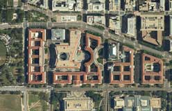
Early maps were all very different. That’s because mapmakers had only themselves, their observations, and their mapmaking tools to rely on. Today, cartographers use satellites and other technology that can detect things from far away. Such tools make maps more accurate and more diverse. These maps use different types of remote sensing. (Above: Microwave Map of Water on Earth)